1. Context
Booking.com has arguably the largest inventory in the world. But in 2023, this strength became a weakness. Users were spending hours filtering through 500+ options, often leaving without booking due to decision fatigue.
The goal was clear: Stop users from "Searching" and start helping them "Choose."
2. Digging Insights
During secondary research, we analyzed traffic patterns. The data showed a clear distinction between "Focused" and "Indecisive" behaviors when comparing with competitors.
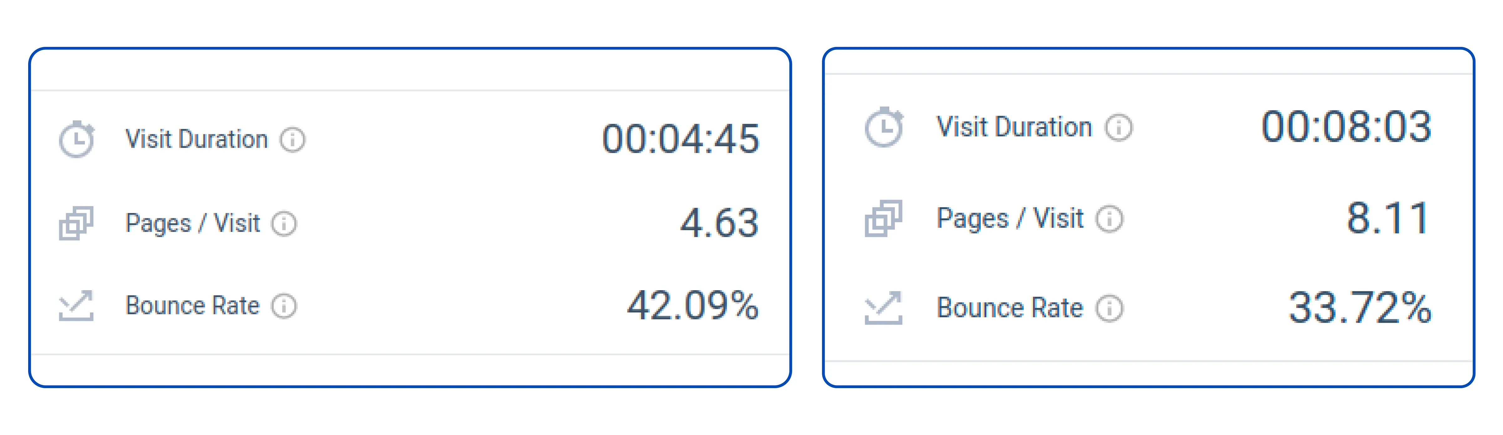
MakeMyTrip
FocusedUsers visit fewer pages but spend quality time reading details. This indicates efficient decision making.
Booking.com
IndecisiveUsers visit significantly more pages with high session duration. This signals choice paralysis.
This data validated Hick's Law: The time it takes to make a decision increases with the number and complexity of choices.
3. Hypothesis
After thoroughly conducting secondary research and gathering a significant amount of information, I felt that I had a comprehensive understanding of the context and was ready to move on to the next step in my research process — formulating a hypothesis.
Personalised recommendations will lead to increased engagement with the product or service.
Recommendations based on user data will result in higher conversion rates compared to generic lists.
Users will have a more positive experience with a product or service when they receive tailored recommendations.
4. Ideation
Brainstorming focused on integrating "Smart Choices" without disrupting the existing user flow. We explored how subtle nudges could appear at critical drop-off points like the search results and property details page. Swipe to see the concepts.
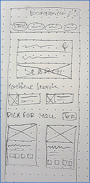
Home Page
The homepage would consist of a very visible section labelled as “Pick For You” to help the user with decision-making upon arrival.
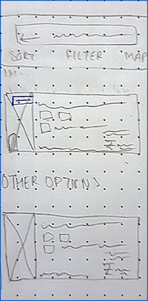
Search Result Page
Cards will consist of a label over the image signifying that the stay is recommended, in a subtle way to avoid visual clutter.
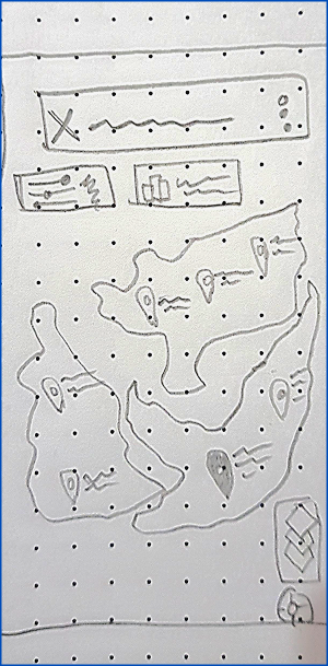
Map View
A specialised location pin icon would signify recommended locations. Clicking it opens a pop-tray with booking info.
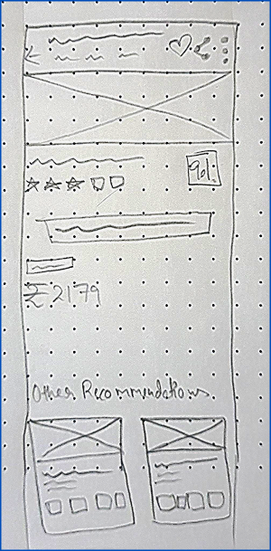
Property Overview
If the user isn't satisfied, a section of recommended options appears at the end as a nudge to prevent drop-offs.
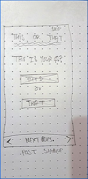
Signup Edge Case
For new users, a low-effort 5-question “this or that” quiz helps capture preferences, incentivized by a 10% discount.
5. Implementation Scope
Given the 48-hour constraint, we had to prioritize ruthlessly. We focused on high-traffic entry points where users experience the most friction. We decided to implement the recommendation engine across these three key surface areas.
- Home Screen Implementation
- SERP (Search Engine Result Page) Integration
- Stay Overview Page Recommendations
6. Validating Idea
We didn't just stop at designing; we put our prototypes in front of 5 users to see if the "choice overload" was actually reduced. The heatmaps and click-tracking revealed fascinating insights about user intent.
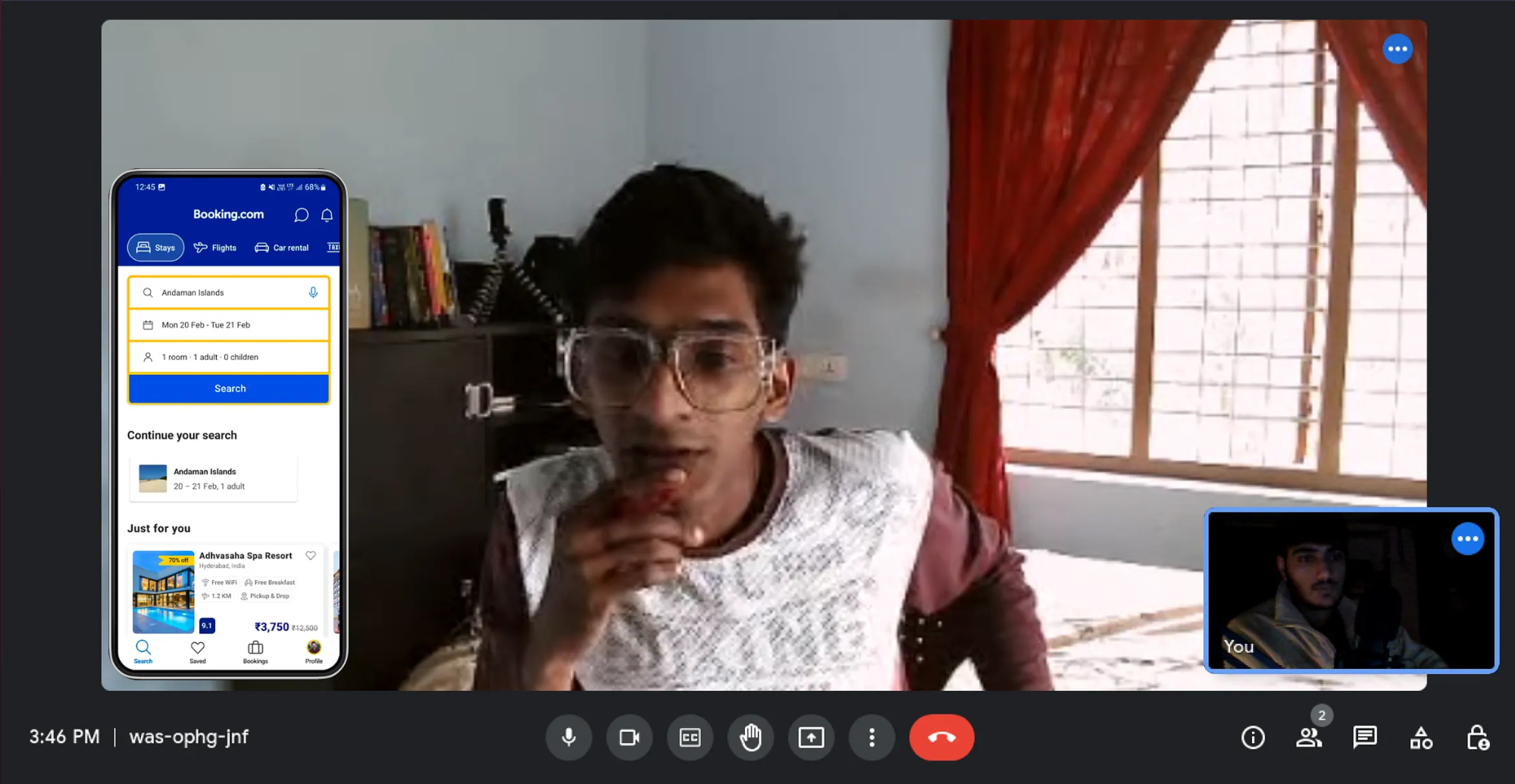
Goals of Usability Testing
-
1
The user’s understanding of the recommendation section on the homepage.
-
2
If they can grasp the distinction between suggested options and general listings.
-
3
Scrolling and decision-making behaviour on the property overview page.
7. Shortcomings & Iteration
First drafts are rarely perfect. Our testing highlighted two major UI flaws that were hindering the very clarity we sought to provide. Here is how we fixed them.
The "Banner Blindness" Issue
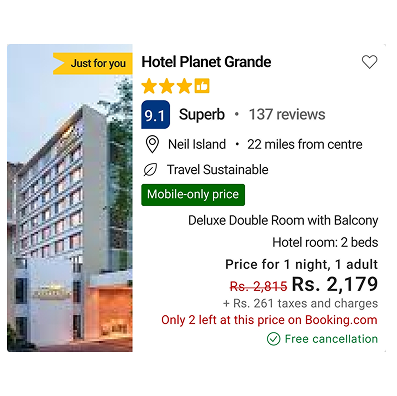
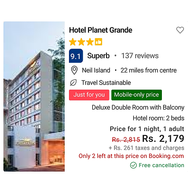
In V1, we used a banner on top of the image to say "Recommended." Users completely ignored it, thinking it was an ad.
We changed it to a high-contrast "Chip" inside the content area and added a subtle glow effect. Visibility improved immediately.
The "Scroll Fatigue" Issue
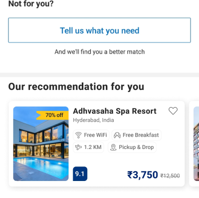
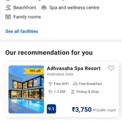
On the Property Overview page, we placed recommendations at the very bottom. Heatmaps showed 0% of users reached that far.
We moved the recommendation section UP, placing it immediately after the facility listing. This catches the user before they abandon the page.
Interactive Prototype
Reflection
Since this was a capstone project, we couldn't measure live post-launch metrics. However, the qualitative feedback from our testing sessions was clear: Users feel safer when the system curates for them.
If implemented, we hypothesize a significant reduction in time-to-book and an increase in return user rate (CLV), as the platform transforms from a directory into a concierge.